2013
DISCONNECTED THOUGHTS
by Jeremy Gilbert-Rolfe
From MARY BOOCHEVER Monograph
When my second collection of essays was published in 1995, one of the reviewers complained that whereas the first collection, published ten years earlier, had contained essays about known heavies like Brice Marden, the second didn’t talk much about persons of that public stature by rather about artists who were relatively unknown, like Chris Haub and Mary Boochever. He did not seem to want to derive from that the obvious implication, that the writer had decided that Brice Marden was no longer all that interesting, but Mary Boocheever was. Of course, Marden continues to make works at which we should all look, but by the end of the seventies, he seems to me, to have turned all that was profound and complex in the works he had made before that into a kind of style, having to do with all the things that good painting is supposed to be. I have, generally speaking, not found this very exciting.
Boochever’s work ranges from the extremely quiet to the totally nuts, and I find it constantly exciting. Her work is never about good painting and always about what painting could do. She makes works which are so simple and straightforward that one wonders both why they work and why she thinks she can get away with it. And others that go straight to a quite complicatied idea about body and thinking, which is in my view what the most exciting painting usually does (Manet, Mondrian, Pollock, are who come to mind, I don’t know who’s in hers, almost certainly artists from Asia as much as from elsewhere, with Rudolpf Steiner sitting on a cloud nearby).
I recently had the opportunity to write about Boochever’s work as part of an essay about geometric abstraction. I think she takes the spirit of early abstraction in the sorts of directions it implicitly and in some cases explicitly wanted to go. In this sense she’s quite a traditional artist but at the same time also one who has no difficulty in thinking in terms which are not restricted by culture.
The universal aspirations of early abstraction are realized in her work on a day-to-day basis. The works I wrote about for the essay about geometric abstraction were derived from an Asian diagram about the connection between the extremities of the body and its interior, and it was both straightforward to compare her work with others whose sources were quite different and at the same time clear to see that here idea of what painting can be and do was and is one that cannot be contained, and therefore not explained, by recourse, for example, to an idea of ‘good painting’ or any other explanation or interpretation which begins with style or a restricted notion of the history of art.
1986–1993
An excerpt from Beyond Piety: Critical Essays on the Visual Arts
by Jeremy Gilbert-Rolfe
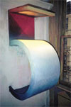
Five is shaped like the number from which it takes its name, and made of a curved part, a canvas, and a window. Staring into it from the front presents one with a convergence between three kinds of surface, three possibilities for light: in front of one’s face, a diagonally divided square painted with reds; above it, serving as the horizontal bit of the figure Five, the window, made of yellowish frosted glass, which inflects light with the properties of both concentration and dispersal as it projects it downward; below that, the top of the Five’s curve, a fairly thick surface in that here the paint is applied over a china clay ground, a tactility both absorbent and reflective, a curved surface and therefore never parallel to one’s field of vision except at a single, entirely hypothetical, point, and elusiveness which is a property of what is also the most thing like part of the work.
And, in that it is white turning to blue where it meets the wall, that is, as it gets further away from the viewer, a surface which is there but always engaged in slipping away, white reflecting light, changing to blue and in that inventing distance (reconvening the properties of the sky). A nonhomogenous pictorial surface, a space made out of the primary colors where white—absolute light, or light as the principle of disembodiment—intervenes in the series yellow-red-blue (expansion-hovering recession) as the work comes closest to the viewer. Being understood as a space, it is therefore at no time exclusively a surface, but can instead only be understood as a movement through appearances, founded in three kinds of luminosity, the translucency of glass, the interior glow of oil paint, the reflective white surface which turns into distance, each of which depends on a concept of completeness—the figure Five, a sign standing for an amount—and therefore of being as opposed to construction in some way, but which constitutes that idea of being entirely in terms of its deconstruction, of deferral. Everything here is present as something which cannot possibly be entirely present, definitively outside the interests of historical meaning, which is moral, categorical, obsessed with context (e.g., meaning in Richter or Beuys), but also irreducible to any idea of either expression or its corollary, thingness.
March 19, 2004
The Boston Globe
by Cate McQuaid
GALLERIES
“Dense” crucible combines clay, paint, sculpture.
There’s something almost holy in the grouping of artists in “Dense,” an exhibition at the Genovese/Sullivan Gallery. Vermont potter Malcolm Wright provided the impetus for the show with a body of work different than anything he’d done before. He fired his clay at a wood kiln in Elkton, OR, where the ashes of West Coast trees infused it with different tones; he left it in the kiln for 100 hours, rather than his usual 24. David Sullivan and Camellia Genovese then sought out other artists on their roster, making work that varied from the rest of their oeuvre. They tapped painter Mary Boochever and sculptors Jay Swift and Matt Harle.
It isn’t so much how these artists veer from their own work as how they come together that impresses. Each demonstrates such a devotion to material and purity of form that most of the work is utterly simple, yet transcendent. Harle is the exception; like the others, he swears by material and process. But he has an aesthetic that intends to prod and prickle. The other three stick to color and form, and so to beauty. Harle’s wormy rubber wall hangings go against this grain.
Even so, step into the gallery and you’ll wish you had brought a cushion to sit on and meditate, the space is so soothing and peaceful. Swift, who ordinarily makes free-standing stone sculptures, here contributes flat wall sculptures that are fashioned from slate and granite. Fanciful, rounded biomorphic shapes cast vivid shadows on the wall; despite their density, they're gestural and as light as bubbles.
Boochever, always fascinated with the juxtapositions of colors, here devotes herself to the subtleties of a single tone: gold. She frames “Lux Interna” with gold-leaf-covered wood. The canvas inside replicates the tones of the frame in paint. The gold frame glitters, casting light out; the canvas, much flatter and subtly imbued with green and red, is like a still pool pulling you in. Peaked at the top, it’s a 21st-century altarpiece, a site for endless contemplation.
Wright’s vessels stand in the middle of the gallery. Unglazed, they illustrate the mystery of the firing process, as dripping ash paints over the surface of the clay. The bowls are an uncanny conflation of red earth and swirling galaxies; a single, elegant line drawn in the clay spirals to the bottom.
The ceramist’s firing process is a good metaphor for the crucible of creation all artists go through, offering up their materials and skill to the fate of an intense process. In the case of these three, that process distills earth-born materials into works of limpid clarity.
A new take on adventure tourism Youngsuk Suh is a people-watcher and a landscape photographer. His large-format color photos at Clifford-Smith Gallery capture the majesty of national parkland on Maui: the intoxicating verdure, the almost Martian volcanic landscapes. Suh shoots many images over a period of hours, then culls through them digitally, tweaking tones and adding or removing figures from the scene as if he is playing with toy soldiers.
In most of the images, the tiny people appear oddly heightened and disconnected, both from the landscape and from one another. They don’t look at one another. They aim their cameras in strange directions. Clad in shorts and sneakers, wearing fanny packs, they tread along a footpath in a lava-burned desert. Or they scramble around the lush, rocky cove surrounding a waterfall, like ants at a picnic.
Such comments on adventure tourism and on how these T-shirt-clad adventurers are both exposed to and protected from the rawness of nature. A national park, in essence, is a wilderness theme park. His lush prints, soaking into velvety paper, pay tribute to natural beauty and question how it has been packaged. There’s something hapless and endearing about the tiny people wandering through these vast landscapes. There’s also something irksome about them: They get in the way of the viewer’s utopian vision of national parks.
That’s the artist’s intention: His viewer’s longing for the wilderness is no different than that of his subjects. But Suh doesn't criticize our human need for vaulting beauty in these photos. Juxtaposing the tiny people and the giant Hawaiian landscape, he suggests that the pursuit of beauty is both humble and noble in itself.
Where clinical meets spiritual Audrey Goldstein’s ambitious installations at Kingston Gallery wittily conflate digital, physiological, and language systems. They come together in spaces that are part Frankenstein’s lab, part health spa, part spiritual retreat.
“Acupuncture Table” is set up within sheer white curtains, suggesting the hush of a practitioner’s room, but also something heavenly. Needles trace the form of a body in a tabletop of wire mesh. Cables snake across the floor in a pattern from the table legs to a plastic tower, as if the patient’s chi, or energy, is being siphoned off. Taut knotted strings at the top of the tower refer to an ancient Incan wand, perhaps used as a language system. Circuitry below fronts a wall prickling with stiff hairs, like those that process sound in the inner ear.
This complicated pattern of transmitters and receivers replicates the absent figure on the table; they also suggest that these systems, one layered on the next, are more connected than we know.
With “Acupuncture Table” and her other installation, “Cupping Chair,” which takes off from a healing practice that uses warm cups to draw toxins from the body, Goldstein ties the figure into these vast energy channels.
There’s serenity to this work, but also something fearsome in the Frankensteinian undertones of hooking humans into other systems such as computer circuitry. Goldstein’s work embodies that fine tension between the allure of individuality and that of being part of something greater.
This story ran on page D22 of the The Boston Globe on 3/19/2004. ©2003 Globe Newspaper Company.